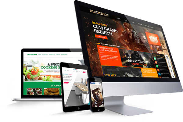
You can’t be all things to all people, but you can certainly try improving website Usability for both web browsers and the visitors who trickle onto your site. Still, it can be an agitating task. But there’s good news. It doesn’t have to be that way. Avoiding the frustration of trying to make your website more usable can be done with a little planning and contemplation. Read on to learn ten helpful strategies to improve your website’s usability.
Lefty
People in Western Culture tend to read from right to the left. What’s interesting about this is that when they look at a website, studies show that their eyes naturally gravitate to the lefthand side of the page. That’s why it’s a good idea to put essential information where people look first.
Let Your Eyes Breathe
A good artist knows how to use negative space to their advantage. The same goes for designing a website. Some designers don’t like the way a blank margin or negative space looks on a screen, but studies show that negative space helps people grasp what you want to say. Giving readers a better opportunity to comprehend improves the site’s usability, and it’s easier on the eyes.

Little Big Thing
When users look for a page on your website that doesn’t exist, it can feel impersonal to flash a “404” error sign across their screen. Instead, try replacing the error page with a message that says something along the lines of “Whoops, that page isn’t here. Let’s try that again.”
Stop Searching
It can be frustrating for users to have to rely on your site’s search engine to find what they want. To combat this, make sure your site’s information is organized clearly and reasonably, which will, in turn, improve the way users access your site’s content.
Leave Home
Studies show that 98 percent of searches will not lead user to your website’s homepage. As such, it doesn’t matter how much work you’ve put into it or how fancy it is, because chances are most surfers will not see it. Spending your resources on content on other pages might be the smarter thing to do for your business.
Keep Copy Relevant
In the olden days, when people only got their information from physical newspapers, there was a popular phrase among journalists: “Above the fold.” Basically, it was valuable to put a bulk of pertinent information at a place where people would look first. But now, the school of thought is different. As long as your content is readable and applicable, you can have a long form article on your site without worrying.
Read Easy
When you get so wrapped up in an industry, it’s very easy to adopt jargon in your everyday vocabulary. However, for people new to what you do, jargon and industry-insider words can be confusing. That’s why you want simplify your content by avoiding these. Don’t make the mistake of thinking new users aren’t smart enough to grasp your copy. Instead, cater to newcomers. You’ll get more business and increase usability.
Sprint
You might think that outfitting your website with music, high-touch videos and glossy banner ads will increase a user’s experience, but it really just slows things down. Speed is one of the most important components to functionality, especially considering how impatient customers can be. So, losing the optional extras can speed things up and, in turn, make for a better user experience.
The Letter “F”
“F” is one of the most important letters you can use when setting up a more usable site. Just like the first tip on this list, putting an emphasis on the upper left side of the page makes it easier for users to find information. Text should read left to right and down, just like the shape of the letter “F.”
How Much is Too Much?
Developers used to think that if a user doesn’t find what they’re looking for after a few clicks on your site, they will give up. Newer studies prove that wrong by showing that users will stay on your site as long as they feel like they’re heading in the right direction. Set up a good roadmap so that users feel like they’re heading in the right direction. Set up a good roadmap so that users feel like they’re making headway.