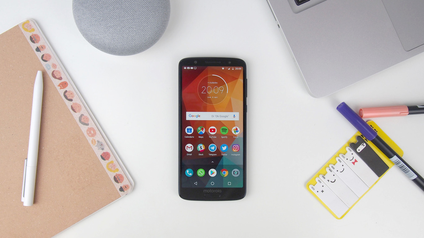
One more year, the legendary Moto G saga is back, and this time comes stomping. The competition tightens more than ever and Motorola has no choice but to raise the bar to make clear that the Moto G was not only the mobile that started it all, but it came to stay.
After a Moto G5 that left us very good taste, Motorola brings us a Moto G6 more premium than ever. This year we have a striking glass design, 18:9 screen, double camera with the popular portrait mode and face recognition. Very current and interesting news for a mid-range, but which are accompanied by an increase in the price. We analyze all these developments and more below …
Moto G6 – Technical Specifications
| MOTO G6 | |
|---|---|
| DESIGN | 153.8 x 72.3 x 8.3 mm 167 g Glass backside Front fingerprint reader Water repellent coating pi2 |
| SCREEN | IPS 5.7 inches 18: 9 FullHD + 2.160 x 1.080 Corning Gorilla Glass 3 |
| PROCESSOR | Snapdragon 450 octa-core 1.8 GHz Adreno GPU 506 600 MHz |
| RAM | 3/4 GB |
| CAPACITY | 32 /64 GB + 128 GB MicroSD |
| SOFTWARE | Android 8.0 Oreo |
| REAR CAMERA | 12 + 5 MP, f / 1.8, FullHD video 60fps |
| FRONTAL CAMERA | 8 MP, FullHD video 30fps |
| CONNECTIVITY | LTE, Dual SIM, WiFi 2.4 + 5 GHz, Bluetooth 4.2, NFC, GPS, minijack, USB-C |
| BATTERY | 3000 mAh Fast Charge TurboPower |
| PRICE | 3/32 GB: 249 dollars 4/64 GB: 269 dollars |
Design: Reduced frames, crystal suit … this was not a mid-range?
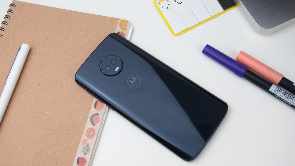
The Moto G6 is an important leap with respect to the previous model and the design is where it is most noticeable. After a Moto G5 with removable carcass that, although well built, conveyed that feeling of economic mobility, the Moto G6 raises the bar of design in every way.
To start the case is fixed and we can not access the battery, it is the price to pay for a better construction. The Moto G6 feels solid in hand, but it is not heavy at all and the glass gives it a distinguished touch, although we already know that everything has disadvantages and that of glass are the traces.
With respect to the resistance, the terminal does not seem fragile at all, but it is already known that the crystal is not too compatible with the falls, proof that of course I have not done. The good news is that Motorola includes a transparent case in the box, a detail that we see in more and more mobile phones and that is an advantage both from the point of view of protection and grip; the bare glass is not very slippery, but with the cover the fixation is better.
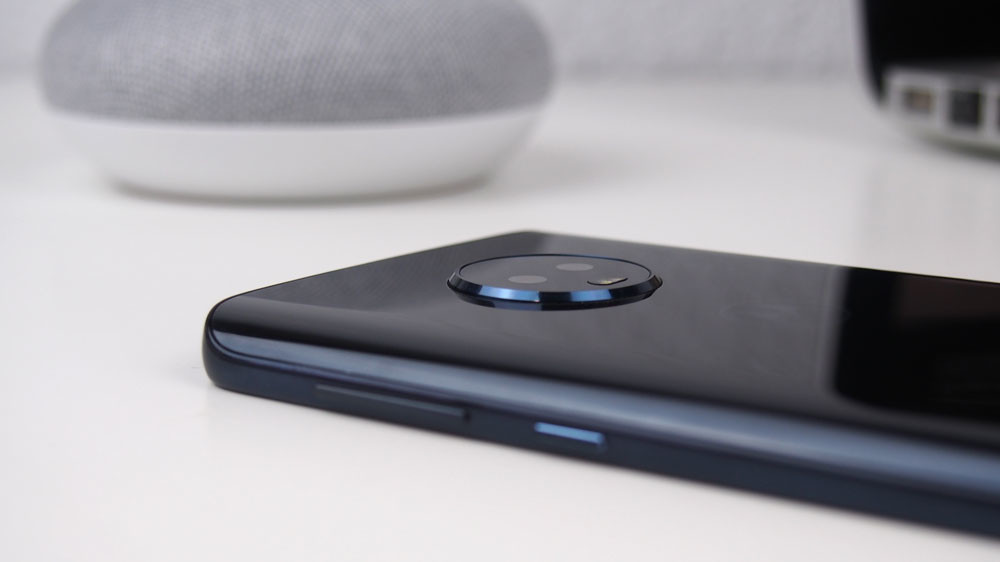
The model tested is dark blue, a tone that sometimes looks black but creates very beautiful reflections depending on how the light strikes. A detail of the back cover is that the sides are curved and, at least to me, it reminds me quite the style of the latest Samsung Galaxy S. Of course, Motorola maintains its identity with that rear camera (which by the way is now double) placed in a circular piece. The bad: it continues to stand out from the chassis. Again, the silicone sleeve is the solution.

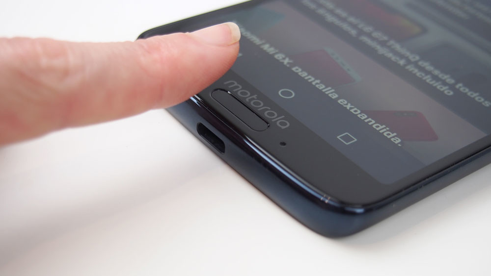
We go to the front, where we see that the latest trends are also present with a more elongated screen, slightly rounded corners and more adjusted to the edge than usual. Point for the Moto G6 to keep the fingerprint reader in the front, button that by the way has a fairly long shape and hardly takes up space, but that coexists with the logo of the brand. In the end, although there is a clear compaction, the lower frame is much wider than the rest.
As best we can see the evolution in terms of compaction is to face it with the Moto G5. The model of last year had a much smaller screen, but the total size of the device is not much more compact, only in height, while the width was greater. There is also an increase in weight, although here the materials also have to do. The use of the front is the key point, which goes from 65% to 75%. Without a doubt, one step forward.
The Moto G6 goes very well with respect to other current phones. Its front is in the line of smartphones like the Redmi 5 of Xiaomi, the Honor 7A or the Alcatel 5. The LG Q6 and Huawei P20 Lite scratch a few more points, but it does not make a huge difference.
| MOTO G6 | MOTO G5 | XIAOMI REDMI 5 | HONOR 7A | LG Q6 | HUAWEI P20 LITE | ALCATEL 5 | |
|---|---|---|---|---|---|---|---|
| SCREEN | 5.7 inches 18:9 FullHD + |
5 inches 16:9 FullHD |
5.7 inches 18:9 FullHD + |
5.7 inches 18:9 HD + |
5.5 inches 18:9 FullHD + |
5.84 inches 19:9 FullHD + |
5.7 inches 18:9 HD + |
| FRONT PERCENTAGE | 75.4% | 65.4% | 75.9% | 75.4% | 78% | 80.5% | 77.4% |
| DIMENSIONS | 153.8 x 72.3 x 8.3 mm | 144.3 x 73 x 9.5 mm | 151.8 x 72.8 x 7.7 mm | 152.4 x 73 x 7.8 mm | 142.5 x 69.3 x 8.1 mm | 148.6 x 71.2 x 7.4 mm | 152.3 x 71.1 x 8.4 mm |
| WEIGHT | 167 g | 145 g | 157 g | 150 g | 149 g | 145 g | 144 g |
Screen: More size and new format
We commented that the Moto G6 screen is much larger than previous models, 5.7 inches to be exact, but this is not the only change. As it could not be otherwise, the average range par excellence gets on the car of the elongated screens and now its panel is 18:9, which means that the resolution is adapted in what we know as FullHD + (2160 x 1080 pixels).
With a density of 424 ppi, the Moto G6 meets more than enough in the part of sharpness, while offering a correct experience in terms of contrast and viewing angles. The colors are correct, although they tend to look somewhat cold, especially whites.
Here Motorola includes a couple of configuration options, the standard and intense modes and the warm or cold temperature. In the first I used the intense mode since it does not saturate excessively and gives a more vivid touch. In the second I prefer the neutral option, it does not allow a fine adjustment but it only offers three positions and the change is too abrupt.
Taking into account the range in which we are, the visual experience offered by the Moto G6 does not present any obvious complaint and the tactile response is good. The brightness is the weakest part and in which a little more intensity is missed, but it does not reach the point of preventing outdoor reading. On the automatic brightness system there are no complaints, usually correct and I have rarely had to adjust manually, only in some cases that has been slower than usual.
Performance: Better sensations than ratings
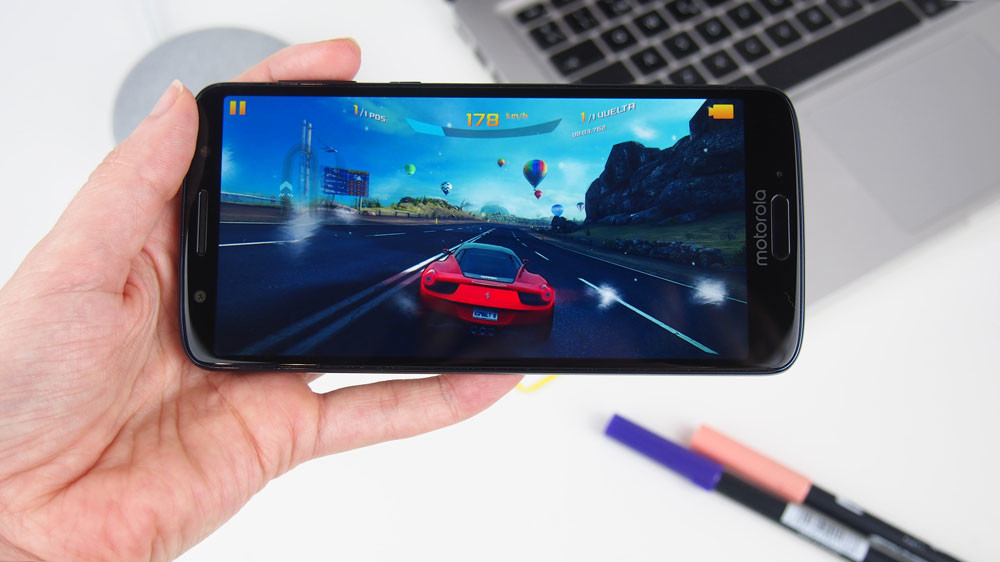
With the Moto G, it usually happens that, although specifications do not have very powerful chips, the optimization of the system makes the fluidity more remarkable. The good sensations are maintained with the Moto G6, although here we also have a power jump when riding a Snapdragon 450, a chip that we have already tested on other models and that has proved to be an interesting option in the mid-low range.
The Snapdragon 450 offers smooth performance and the 16GB is finally a thing of the past.
In daily use I will not say that the Moto G6 flies, but it offers a very fast and fluid operation that makes the most common tasks run with total ease. We do not have lag in the animations, warming nor there are problems with the multitasking (by the way, the model analyzed is the one that has 3 GB of RAM, but there is a 4 GB model), although it is certain that on some occasion There has been some slowness in processing the orders, but as I say it has been punctual. Speaking from memory, point to Motorola because this year we have 32 GB in the base model, nothing of 16 GB.
Obviously, if we want to enjoy games of great graphic load, we will notice that the Snapdragon 450 has certain difficulties, but it is not impossible to play titles like Asphalt 8. In the synthetic tests the Moto G6 scores slightly below other mobile phones with the same configuration, but I insist that in practice the sensations are very good. We have also included the Moto G5 to see the jump between generations.
| MOTO G6 | MOTO G5 | XIAOMI REDMI 5 | ZTE BLADE V9 | |
|---|---|---|---|---|
| PROCESSOR | Snapdragon 450 | Snapdragon 430 | Snapdragon 450 | Snapdragon 450 |
| RAM | 3 GB | 2 GB | 3 GB | 3 GB |
| ANTUTU | 68,876 | 45,741 | 70,360 | 70,273 |
| GEEKBENCH 4 | 740/3852 | 628 / 2557 | 766 / 3500 | 753 / 3754 |
Before closing this section we must mention the operation of the fingerprint reader, which as I said is in the front, just below the screen. The fluidity remains in the reader, who despite its narrow form has no problems in recognizing the footprint. In the security part we also have the facial unlocking, but we’ll talk about that later.
Autonomy: Fast charge and USB-C

We said that the Moto G6 is an important leap over the previous generation, but not only in design or format, but also in autonomy. The terminal adds a few milliamps more to its battery (3000 mAh) that are very welcome, although the part that stands out is that the USB-C reaches the mid-range and also comes with a fast charger ‘Turbopower’.
First let’s talk about autonomy. During the test, the usual thing was to overcome the whole day with a single load, arriving a day and a half long on days of little use and a day with more intensive use, but in no case I had to ‘refuel’ before finishing the day The usual thing is that the screen time is around 6 hours and a half.
As for the load, the TurboPower system allows loading from 0 to 100 in 1 hour and 45 minutes, which is not bad. As it usually happens, the load is faster at the beginning, being able to reach 25% in about 15 minutes. In one hour it reaches approximately 75%, while the remaining 25% is the slowest.
Software: Android (almost) pure with facial unlocking
The Moto G series is synonymous with Android experience with very little customization, so before turning on the Moto G6 I knew what I was going to find. If, like me, you prefer a non-intrusive and well-optimized layer , Motorola’s is one of the most ‘user friendly’ and offers the best performance.
The Motorola interventions in this launcher are minimal, and those that we have are quite practical.
Motorola’s interventions in this launcher are minimal. On the home screen we have the date and time widget with a round shape that reminds us so much of the circular shape of the camera. It also includes the Moto app in which a series of features are combined, such as the blue light reduction mode, a tool to free space and suggestions for energy and location.
As part of this slight personalization, the Moto G6 also includes the Moto screen, a kind of Always On adaptation that shows information when we put our hands to the terminal, without touching it. We also have other gestures such as three-finger screen capture or navigation with the fingerprint reader that hides the navigation bar to take advantage of the entire screen.
Before we commented that in addition to the fingerprint reader we had the option to configure facial recognition in the start assistant. The experience is good, both for the speed of configuration and the recognition,although as always, it is not the safest method.
In general, the face unlocking usually hits the recognition, but obviously it is faster if there is good light than if we are in a darker area, although it also recognizes us. Of course, to use it is necessary to press the start button and turn on the screen, it is not enough just to look at it.
As I said at the beginning, there are no surprises in the Moto G6 software, but this is good. We have a clean software, with some extra additions are very practical and also updated to Android Oreo so there are no complaints in this regard.
Audio: Correct sound with some extra
The audio section is not usually the strong point in the economic ranges and the Moto G6 follows this trend with a simple sound system, without boasting. If you want to listen to music or watch videos without using headphones, the terminal offers a single loudspeaker located at the top, in the same place where we have the handset for calls. It has a good volume, but the quality is something fair and has the typical metallic sound effect.
Normally the speaker (especially when it is only one) is usually at the bottom edge. The location of the Moto G6 speaker is not usual, but it is certainly much better because when it is on the front the sound is much clearer and that solves the shortcomings that it has.
Obviously the sound is much better enjoyed with headphones, but they will have to be yours because in the box they are not included, a lack that is already common in most mobile phones, especially in the middle range. On the connection there are no surprises: the same minijack of all life.
On the software side, the Moto G6 scored a bit by having Dolby Audio, an improvement that works with both the speaker and headphones, but my preference has already been clear. When activated, we can adjust different modes depending on the type of source we are listening to. The modes are movie, music, game, voice and two custom modes.
Within each mode we can use several presets already created or adjust the equalizer to our liking, which is almost the best option. For example when listening to music, presets open, crisp and concentrated tend to create effects too exaggerated.
Cameras: Two lenses and many options
The arrival of the double camera to the Moto G can be considered the consolidation of duality in the mid-range. Yes, there are many mid-range that carry it. Until Moto Plus G5S had dual camera, but it was only the Plus model and an issue that was announced at year – end, dual camera now reaches the Moto G to dry without eases and pluses.
Specifically we have a 12 megapixel main sensor with f / 1.8 lens, accompanied by a second 5 megapixel sensor that is responsible for reading the depth of the scene to get the popular portrait mode, but also other interesting functions. The front camera has an 8 megapixel sensor accompanied by an LED flash. Before going to analyze the results they offer, let’s see what we offer in the software.
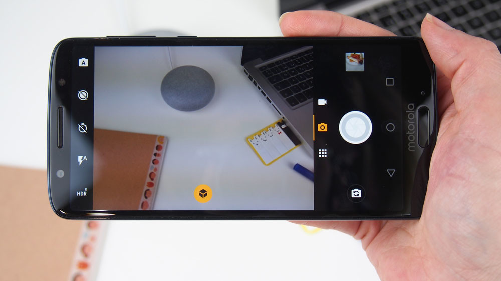
The camera app is another of the sections of the system where we have customization. In the upper bar we have the automatic HDR, the LED flash, timer and manual mode, but there is also the option to capture movement with the function ‘My moments’, a kind of adaptation of Live Photos.
In the lower part, on the shutter button, we have the photo and video modes accompanied by a third button with a grid that hides other shooting modes. Besides the portrait mode, with the double camera we also have the cropping mode to change the background and direct color to keep only part of the photo in color, leaving the rest in black and white. It also includes a filter mode for the face that adds Snapchat-style masks, although much less worked.
There is one more button on these modes that activates the recognition of objects, one of the novelties that the camera of the Moto G6 brings. You just have to press it and it will give us more information about the content of the image, although be patient because sometimes it takes a long time.
Both the camera app and the different editing modes offer a smooth operation in the shot, although some editions are somewhat slower,but nothing serious. The operation is intuitive and convenient since important options are at hand and it is not necessary to navigate through menus to configure them. One thing I like a lot is that you remember the last mode you used, for example, portrait, and so you do not have to be selecting it every time. But let’s go to the mess, these are the results we get with the Moto G6 cameras.
Image Quality
Like any camera, the Moto G6 comes out better if there is good light. The images are sharp, with faithful tones and a fairly wide dynamic range thanks to the HDR. When the detail is extended, it is maintained, but there is already a slight tingling in the processing that leads to noise as soon as the light falls, the advantage is that it is not usually appreciated unless we expand.
Speaking of HDR, the result is pretty good at rescuing darker areas,although it does not work miracles either, and in this case it has hardly done anything in the sky. I usually get pretty natural photos so I recommend using it when the scene requires it. Of course, the detection of when HDR is needed and when it is not something erratic and on more than one occasion I have activated it by hand.
As we said, it is not necessary to be at night for the noise to make an appearance, indoors with good light you begin to notice that characteristic granulate. However, as we said is an effect that only shows when we cut to 100%, the overall plan maintains a good quality.
With closed night the weaknesses multiply. It is easy for the photos to move but with a little pulse and good lighting you can get interesting effects. Again, the cut shows that the detail suffers, but in general the shot is very well resolved, especially from the point of view of the white balance.
Portrait mode
Although it is not the best or the fastest you will find, the portrait mode of the Moto G6 pleasantly surprises. The trimming of the figure is natural and resolves well complex areas, in addition to being able to apply a natural blur based on the depth of the scene.
When the light goes down, it continues to do a good job in terms of trimming. Here it helps that the defocus that it proposes to us by defect usually is smooth and it does that it is not an effect too much ‘goop’. The bad part is that the performance of the camera slows down, it does not happen with a photo but if we do many in a row we start to notice the lag.
The lack of light does not usually affect the trimming as long as there are no movements in the scene and the light is not very complicated. A point in its favor is that, in addition to letting us edit the blur at the time of the photo, we can also adjust it afterwards, so it is always possible to improve the result if we want to soften or reinforce the blur
Selfie camera
As for the selfie camera, here we do not have portrait mode or as many functions as in the main camera, but Motorola does include group selfie mode and filters with Snapchat-style masks. As expected, the quality goes down a lot when using the front camera, but unless you’re going to print them in large format, it’s more than enough to make selfies and upload them to networks.
The beauty mode could not miss. It can be configured automatically, manually or completely deactivated. In automatic does not apply a touch very exaggerated, but it shows, so if you do not like smoothed skin effect better to adjust it by hand.
